

DLG Expert report 03/2017
1st edition, date of issue 03/2017
Authors:
- Dr. Eva Derndorfer, nutritional scientist and sensory analysis expert, consultant, author of books, lecturer at various Austrian universities, Vienna, Austria, eva@derndorfer.at, www.evaderndorfer.at
- Mag. Marlies Gruber, nutritional scientist, Managing Director and Scientific Director of forum.ernährung heute in Vienna, author of technical books and textbooks, lecturer at Austrian polytechnics, mg@forum-ernaehrung.at, www.forum-ernaehrung.at

Consumers have clear (although unconscious) expectations of the optical appearance of their food. The appearance of a product is generally the first feature that can be perceived by the senses. Alongside the colour, other appearance factors include the shape, surface condition, transparency or visible texture properties. However, it is the colour that stands out most, that triggers likes or dislikes, and that supplies the first information about the product quality (for instance the ripeness) or about product properties (such as degree of roasting).
1. Colour and sensory analysis
1.1. Colour vision & colour vision deficiencies
Colours influence the way we perceive a food – provided that we are in a position to see colours. The retina of the eye contains two kinds of photoreceptors – cones and rods. These convert incident light – a physical signal – into an electrical signal that is passed on to the brain. Three different types of cone are responsible for short, medium and long-wave rays, i.e. are sensitive for colour vision.
Rods are responsible for black and white vision. People with normal colour vision can differentiate colours well, but it is much more difficult to remember colours. Colour vision deficiencies are certainly frequent, but they are divided unequally between the genders. For instance one out of twelve men but roughly only about one out of two hundred and fifty women have limited colour vision.
- Protanopia = red colour blindness
- Deuteranopia = green colour blindness
- Tritanopia = blue colour blindness
Just like the other sensory organs, the eye is affected by aging processes. That is why the ability to see colours also changes in old age, as the eye lens becomes cloudier.
Colour vision can be important in the food industry. When panellists, persons trained in sensory analysis, describe products with their properties, they usually mention the colour too. In quality control, typicity of the colour can be examined instrumentally (see DLG Expert report 4/2015) or visually by staff. References such as colour charts or colour fans can be used for this purpose. Comparing the product being analysed with a reference sample or colour standard is known as the “similarity method”.
1.2. Influence of the food colour on the sensory perception of a product
The colour of a food generates a certain product expectation. From childhood onwards yellow desserts are linked with vanilla. We learn this from the colour of vanilla custard and vanilla pudding, even though vanilla pods are black. Red is associated with fruity and ripe, while green is associated with a lack of ripeness, for fruits that are both green and ripe (Granny Smith apples) or fruit vegetables (green zebra tomatoes) are relatively rare.
The eye can deceive other senses by the product expectation generated. In a study conducted with untrained testers, Chardonnay that had been coloured pink was assessed as the fruitiest sample but with the least body, least maturity and least complexity. When the wine was coloured red, it was assessed as having the most body, the most maturity and most complexity.

1.3. Influence of the crockery on the sensory product perception
The influence of the crockery on the perception of foods and beverages has only recently been a subject of more detailed investigation. The colour can act in two ways – it can intensify or weaken the perceived intensity of foods, and it can generate expectations that influence the tasting.
According to a study, strawberry mouse tastes more intensive, sweeter and better on a white plate than it does on a black plate. Hot chocolate drinks are enjoyed to different extents depending on the colour of the beaker. The hot chocolate was rated best in orange beakers. An orange beaker also boosted the sensation of a chocolate taste by comparison with a red or a white beaker.
1.4. Influence of the surrounding colour on sensory product perception
The colour surroundings or the lighting can also influence the perception of a food. This starts during shopping in the retail environment and ends with consumption. Initial studies have produced interesting results. British test persons characterised the same whiskey differently depending on the room – in a green room they found it was grassiest, in a red room sweetest, and in a wooden room it tasted woodiest. The willingness to eat apples was greatest in yellow light, followed by white light. The willingness was lower in cases of red or green illumination, and lowest of all in blue light. Yellow and white light also triggered the greatest willingness to eat red peppers. The crunchiness of the apples and peppers was not affected by the colour of the light. Butter was felt to be more spreadable when it appeared yellower. Under red light, on the other hand, the yellower butter samples in a study were not rated as being more spreadable.
1.5. Consequences for sensory analysis practice
As all colour environments can influence the perception of the product to be tested, sensory analysis laboratories are fitted out in white, beige or light grey. The light and crockery are kept constant. If the colour of the product to be tested is to be masked, appropriate glasses (e.g. black wine glasses, blue olive oil tasting glasses) are used, or coloured light is switched on.
Panellists who are required to assess product colours are subjected to colour vision and colour differentiation tests. This can be done with the aid of an Ishihara test, in which numbers have to be identified on colour plates. Another Fig. 1: The colour of the cup influences the taste of the beverage 4 DLG Expert report 3/2017 method is to produce coloured solutions that the test persons have to arrange in the right sequence. Details of how to produce the coloured solutions can be found in the standard DIN EN ISO 8586.
The colour is also a quality criterion for many products in DLG tests, for instance in fruit juices. In the case of bread, the degree of browning is considered, in the case of cheese any unnatural colour, and in the case of scalded sausages whether these are too pale, too dark, uneven in colour or off-colour.
2. Colouring substances in foods
Many foods contain colouring substances in a high concentration by nature. This is conspicuous and unusual for instance in the case of blue potatoes, violet cauliflower or black maize. These are rarities or old varieties which are, however, seldom ever used in industrial processing, for instance violet maize crisps.
2.1. Colouring foods vs. food colours (additives)
Beetroot, spinach, hibiscus, curcuma, tomatoes, grapes, peppers or carrots are among the colouring foods. They are considered to be food ingredients. They display the respective aromatising physiological effects alongside their colouring qualities, and by contrast with additives they are not subject to any maximum limitations, obligation to make a declaration or to label with E-numbers. They are used to colour beverages, confectionery, dairy products, fruit preparations and ice-creams. Whether they are deemed to be colouring foods or additives of natural origin depends on the treatment and technology methods. Without the use of physico-chemical separation processes such as reverse osmosis or extraction methods, the product is also a colouring food, just as it is when concentrated by water loss under the influence of temperature. If colouring ingredients are not selectively enriched during extraction, the product is also generally a colouring food. However, if selective enrichment is carried out, if the colouring properties dominate, and if other characteristic attributes such as odour or taste are lost, the products are food colours, e.g. as in the case of betanin (E 162), the food colour of beetroot, or chlorophyll (E 140), which is obtained from green plants such as spinach. In 2013 the European Commission adopted a Guideline (Guidance Notes on the classification of food extracts with colouring properties) to define the boundary between colouring foods and food colours. Food colours from natural raw materials that are not foods, and those from source materials of non-natural origin, are always additives. The advantage of purely synthetic colouring substances by comparison with the natural colouring substances lies in the fact that they are heat-stable and light-stable.
Food colours are counted as additives (E-numbers). E-numbers are regulated in the EU Regulation 1333/2008 (FIAP — food improvement agents package). Food colours range between E 100 and E 180 (see table).

2.2. Purpose and history
The addition of food colours can be expedient because on the one hand the food can lose or change its original colour during production or storage, and on the other hand light, air, heat and moisture all affect the colour. For example, strawberry jam looks less red if it is exposed to light. Moreover food colours serve to match the colour shade of foods from different batches. Adding colouring substances or food colours accordingly helps to retain the original colour, or is used to reinforce the natural colours.
Food colours have been used in food production already since 400 BC. In those days the early Egyptians and Romans coloured wine with herbs and spices in order to make it more attractive. Synthetic colours were developed in the late 19th century, also for purposes of decoration and to lend a higher-quality look to foods. During this period colour additives were still toxic and there were no legal specifications. As of the early 20th century colour additives were used widely in the USA and Europe. Up to the time that synthetic colouring substances were developed, dyestuffs obtained from animal, mineral and vegetable sources were used.
2.3. Authorisation, safety assessments and re-evaluations of food colours
In the EU the principle of prohibition with the reservation of permission is applied with additives, i.e. additives are basically prohibited, unless their authorisation is expressly permitted (principle of positive lists). Authorisation is carried out by the European Commission on the basis of an expert opinion from the European Food Safety Authority (EFSA) in a comitology procedure. Additives, aromas and enzymes may be used in foods if they are technically necessary, safe (harmless) and not misleading.
Within the context of the ongoing re-evaluation of all food additives that were authorised in the European Union already before 20 January 2009, the EFSA Panel on Food Additives and Nutrient Sources Added to Foods (ANS Panel) has produced scientific expert opinions on food colours. EFSA defines the ADI (Acceptable Daily Intake) level for each additive. The ADI value is the quantity of a substance that humans can ingest every day of their life without any notable health risk. The ADI value is based on the maximum intake level at which the subject substance does not cause any harmful effects in animal trials. In order to take differences between animals and humans into account, the result (the no-observed-effect-level) is multiplied by a factor of 10 and a further safety factor of 10 is added in order to protect sensitive/delicate individuals and individuals who are not ideally nourished. This thus means that even if the ADI value is exceeded for a certain substance, harmful effects to health need not necessarily be expected.
Assessment of azo dyes
In its expert opinion of 2008, EFSA came to the conclusion (confirmed in subsequent assessments) that scientific findings, including the “Southampton Study”, did not document any causal connection between food colours and possible effects on behaviour. Despite this, foods with the food colours orange yellow S (E110), quinoline yellow (E 104), azorubine (E 122), allura red (E 129), tartrazine (E 102) and cochineal red A (E 124) must bear the warning “may have an adverse effect on activity and attention in children” alongside their labelling (category name, followed by the specific name or the E number) since 20 July 2010.
2.4. Colour and clean labelling
A critical attitude of many consumers to additives and the stricter labelling regulations lead to different reactions among producers. For reasons of promotion and sales, or because of efforts to achieve greater “naturalness” of foods, producers often decide
- to avoid additives,
- to replace them with natural substances that have a similar effect and do not need to be labelled,
- to adopt technical measures to form additives in situ or to trigger similar effects.
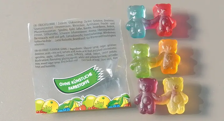
This results in making a “clean label” possible and providing information about the absence or non-use of certain ingredients that consumers rate negatively, such as additives (E-numbers), including food colours. According- Fig. 2: Jelly babies 7 Colours and their influences on sensory perception of products ly ingredients similar to additives such as juices or fruit and vegetable juice concentrates are frequently used instead of food colours (see Colouring foods).
Although “clean” foods are fundamentally safe and of high quality and do not constitute “misleading”, in consumer assessments the use of ingredients similar to additives is frequently considered to be “felt” as misleading. In a survey conducted by the German Federal Ministry of Food, Agriculture and Consumer Protection in May 2013, 26 % of the interviewees responded to the statement “without food colours, but coloured with carrot juice” by saying “I feel deceived” and 13 % with “I definitely feel deceived”. This is extremely surprising – carrot juice and carrot soup are appreciated because of their attractive colouring, but a fruit yoghurt coloured with carrot juice is rejected.
3. Implications for practice
3.1. Producers
Colour design affects not only packaging and formulations of the general product range, but also limited seasonal and event-related batches such as products for Halloween, St. Nicholas’ Day, major sporting events, weddings etc.
In the ready-to-eat segment intensive colour experiences can occasionally lead to extra consumption. A combination of monochrome varieties can attract more attention than multi-coloured offerings. In the same way it is possible to combine products in monochrome fashion in the frozen food segment. Furthermore, producers can provide consumers with new ideas and possibilities of use, for instance in the form of monochrome recipe ideas.

Target groups that respond particularly to monochrome or assorted coloured foods are children and senior citizens. It has been shown that children and adults eat more if jelly balls are offered in 24 colours instead of 6 colours. However, this only applies if they are offered sorted by colour. Vegetable mixtures often do not attract children, not even if they like the individual components. That is why products for children are often “colourful monochrome” and designed in colours that are sometimes not very attractive for adults, for example blue ice-cream.
However, distinctly more value is attached to intensive colours again in older age. Especially in product development for communal feeding, it is essential that components of the dishes can be recognised and differentiated by colour. In general requirements concerning the foods offered change with age – eight out of ten in the 60-to-79 age group stated in response to questioning that as of their mid-50s their needs during shopping began to change from those of younger generations. Not only more easily legible product information, more practical opening mechanisms and smaller package sizes are increasingly desired, but also ‘natural’ and regional food play an increasingly stronger role.
3.2. Retail trade
Why not sort the fresh food department by colours, instead of by varieties? In the same way it would be possible to arrange fruit yoghurts not by brand, but by variety and colour.
Monochrome promotions are more conspicuous in a product programme that is in any case coloured. Many retail chains publish customer magazines with recipes. Depending on the seasonally available colours and the region, monochrome meal ideas are conceivable here too. In this way it would be possible to sell goods on a “seasonal and regional” basis without over-working these catchwords.
4. Black & white food
What foods are black or white? We have compiled the natural diversity of non-coloured foods in Table 2. This feature can also be found in old and special fruit and vegetable varieties, such as white strawberries, white aubergines or black chilli. To retain the white colour, attention must be given to low temperatures during preparation. It is primarily anthocyanins in highly concentrated form that are responsible for black foods. In sepia, this role is played by grey-black melanin. Foods are coloured black with the aid of Brilliant Black, caramel or vegetable carbon. White foods do not contain any colour pigments. Foods can be coloured white with calcium carbonate or titanium dioxide.
Black or white foods also result from industrial or kitchen-specific preparation. Black can result from turning in ash (e.g. cheese) or cooking in vegetable carbon or grilling, while white for example can result from whipping egg-white, from making fat in water emulsions, or by mixing raki with water.


What does the reduction to black/white bring about in the preparation and eating of foods? Above all it boosts creativeness (Fig. 5). Deliberate restriction expands culinary and sensory horizons.
Special occasions for black and/or white dishes are traditional occasions such as christenings, first communions, weddings, or funerals. Furthermore, certain target groups respond to this reduction:
- foodies, trendsetters, curious consumers,
- creative persons, architects, artists, aesthetes,
- sensory analysts, cooks, trade personnel from the food sector.


5. Conclusion
A focus on colours and non-colours can open up new ideas among food producers, caterers and retailers for products, dishes, placements and promotions. Monochrome food promotes a seasonal and regional product selection. Single-colour dishes or limited editions in a single colour attract attention above all in an overall monochrome setting and promote conscious sensory perception.
Literature:
- Bohacek H: E-Nummern-Liste. Die Zusatzstoffe in unseren Lebensmitteln. AK Niederösterreich, 2016
- Delwiche, J.F.: Impact of Color on Perceived Wine Flavor. IN: Foods Food Ingredients, J. Jpn. 208, 2003, 349 – 352.
- Derndorfer E., Gruber M.: Farben essen. Maudrich Verlag, 2015.
- DIN EN ISO 8586
- Glogowski S. Ernährungstrend: Clean Eating. Ernährungs Umschau 62(7): M381
- Gruber M: f.eh-Genussbarometer „Best Ager“ 2014. http://www.forum-ernaehrung.at/artikel/detail/news/detail/News/feh-genussbarometer-best-ager-2014/
- Kahn B.E., Wansink B.: The influence of assortment structure on perceived variety and consumption quantities. IN: Journal of Consumer Research 30: 519-533, 2004.
- Kodritsch T: Frei von … – der Trend zu „Clean Labelling“. Ernährung heute 4. 10-11. (2013)
- Magoulas C: How color affects food choices (2009). UNLV Theses/Dissertations/Professional Papers/ Capstones Papers 552.
- Piqueras-Fiszman B., Alcaide J., Roura E., Spence C.: Is it the plate or is it the food? Assessing the influence of the color (black or white) and shape of the plate on the perception of the food placed on it. Food Quality and Preference 24, 2012, 205-208.
- Piqueras-Fiszman B., Spence C.: The Influence of the Color of the Cup on Consumers‘ Perception of a Hot Beverage. Journal of Sensory Studies 27, 2012, 324-331.
- Rohm H., Strobl M., Jaros D.: Butter colour affects sensory perception of spreadability. Zeitschrift für Lebensmitteluntersuchung und -Forschung A 205, 1997, 108-110.
- Velasco C., Jones R., King S., Spence C.: Assessing the influence of the multisensory environment on the whisky drinking experience. Flavour 2, 2013, 23.
- Verordnung (EU) Nr. 257/2010 DER KOMMISSION vom 25. März 2010 zur Aufstellung eines Programms zur Neubewertung zugelassener Lebensmittelzusatzstoffe gemäß der Verordnung (EG) Nr. 1333/2008 des Europäischen Parlaments und des Rates über Lebensmittelzusatzstoffe, Amtsblatt der Europäischen Union, L 80 vom 26.3.2010.
- Verordnung (EG) Nr. 1333/2008 des Europäischen Parlaments und des Rates vom 16. Dezember 2008 über Lebensmittelzusatzstoffe.
- Yang F.L., Cho S., Seo H.-S.: Effects of light color on consumers‘ acceptability and willingness to eat apples and bell peppers. IN: Journal of Sensory Studies 31, 2016, 3-11.
- https://www.bll.de/de/lebensmittel/zusatzstoffe/_3
- https://www.lebensmittellexikon.de/f0001030.php
- http://ec.europa.eu/food/safety/docs/fs_food-improvement-agents_guidance_additive-eu-rules.pdf
Contact
Bianca Schneider-Häder - DLG Competence Center Food (DLG-Fachzentrum Lebensmittel) - Tel.: +49 69 24788-360 B.Schneider@DLG.org